
Work / Case study · S&S Hospitality
Eight restaurants. One house style.
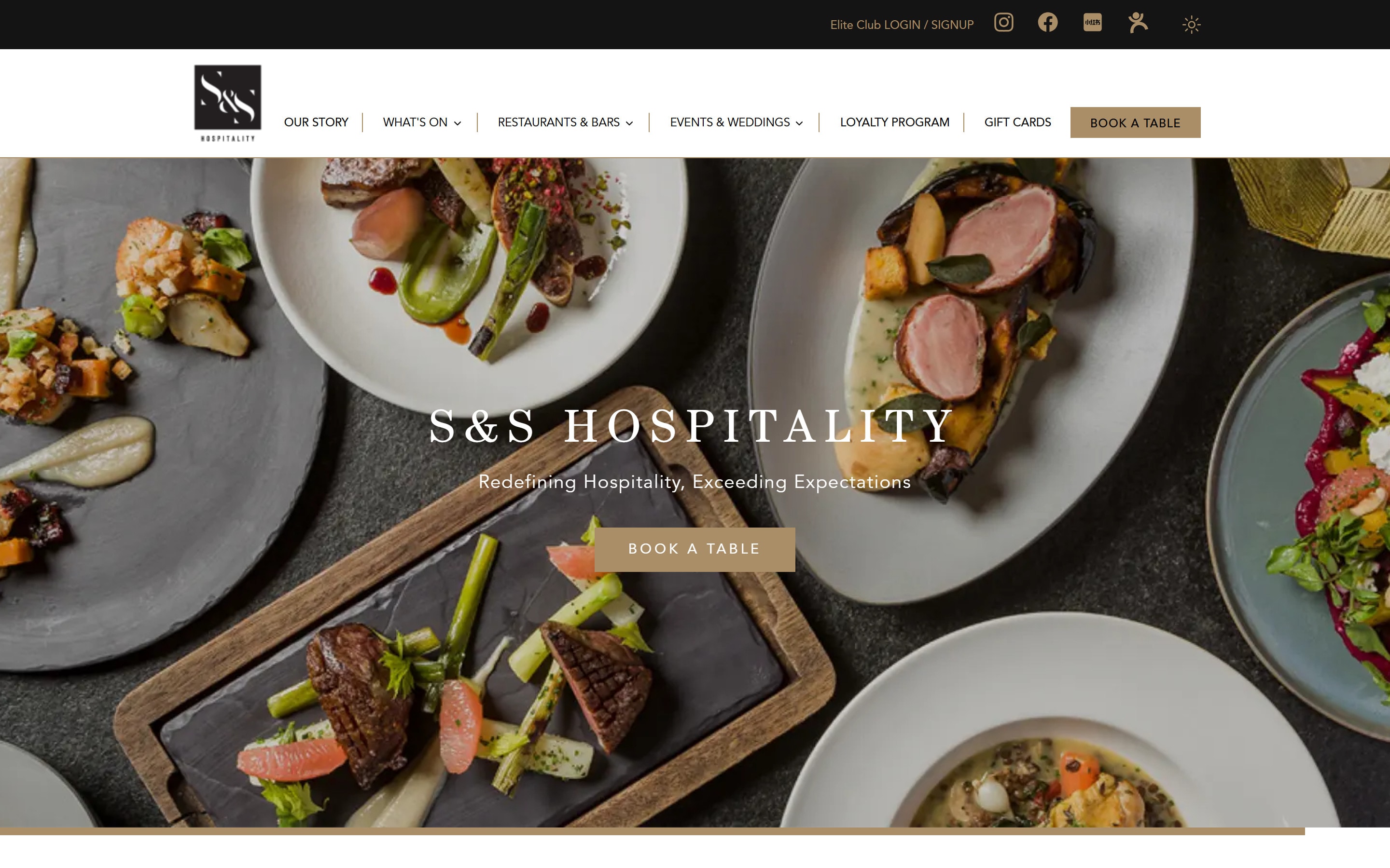
S&S Hospitality runs some of Hong Kong's best-loved restaurants and bars, from a French bistro in Soho to a Brazilian churrascaria in Lan Kwai Fong. We designed one website where every one of them feels like itself, and all of them feel like S&S.
- Client
- S&S Hospitality Ltd.
- Since
- 2023, ongoing
- Role
- Design, build, care
- restaurants and bars on one design system
- 8restaurants and bars on one design system
- themes, light and dark, from the same components
- 2themes, light and dark, from the same components
- partners since; we still design and run it
- 2023partners since; we still design and run it
- CMS where the team updates menus, offers and stories
- 1CMS where the team updates menus, offers and stories
The challenge
Eight personalities.
Not eight websites.
Indian, Brazilian, French, Argentinian, Italian and a harbour-view steakhouse: each restaurant has its own logo, its own colours and its own crowd. A group website that flattened them into one look would lose what makes them worth visiting.
The opposite, eight unrelated designs, would hide the group behind them: the loyalty club, gift cards, weddings and events that work across every venue. The design had to hold both.
One frame, eight brands
The restaurant leads. The frame stays.
Every restaurant opens with its own logo on its own room. Everything around it, from type to buttons, is the same S&S system.
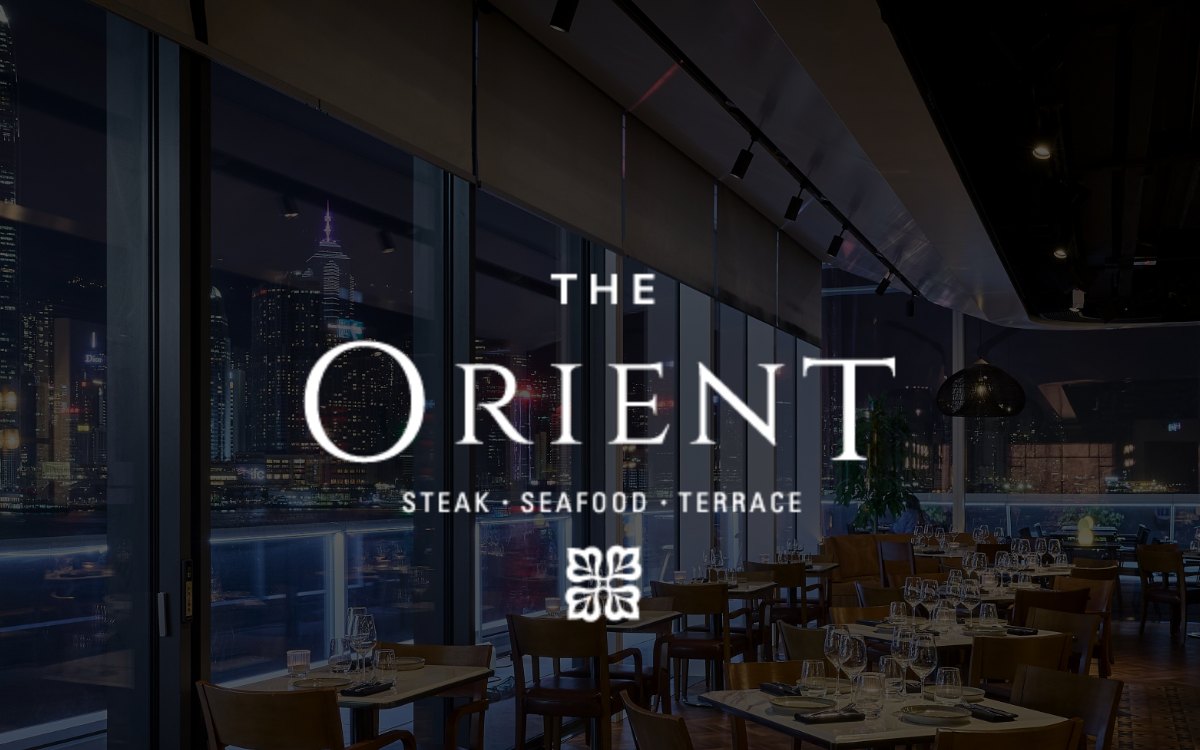
The Orient
Steak, seafood & terrace · Tsim Sha Tsui
ALTO
Bar & grill · Causeway Bay
Bombay Dreams
Indian cuisine · Central
BRAZA
Brazilian churrascaria · Lan Kwai Fong
Bouchon
French bistro · Soho
Boticario
Argentinian grill & cocktails · Tsim Sha Tsui
Tango
Argentinian steakhouse · Lan Kwai Fong
SPIGA
Contemporary Italian · Central
The design system
Three rules, applied everywhere.
- 1.
A quiet frame
White space, thin lines and a restrained layout, so each restaurant's photography and logo do the talking.
- 2.
Gold is the thread
One warm gold carries buttons, titles and links across all eight brands, so every page still feels like S&S.
- 3.
Serif to dine, sans to read
Century for names and headings brings the elegance; Avenir keeps menus, details and forms easy to read.
Typography, from the live site
- Century
- Restaurant names, headings
- Avenir
- Body, menus, buttons, forms
Colour
Gold #A98E67
Buttons, titles, links
Night #141414
Dark theme, footer
Linen #F5F5F5
Light sections
White #FFFFFF
Pages, cards
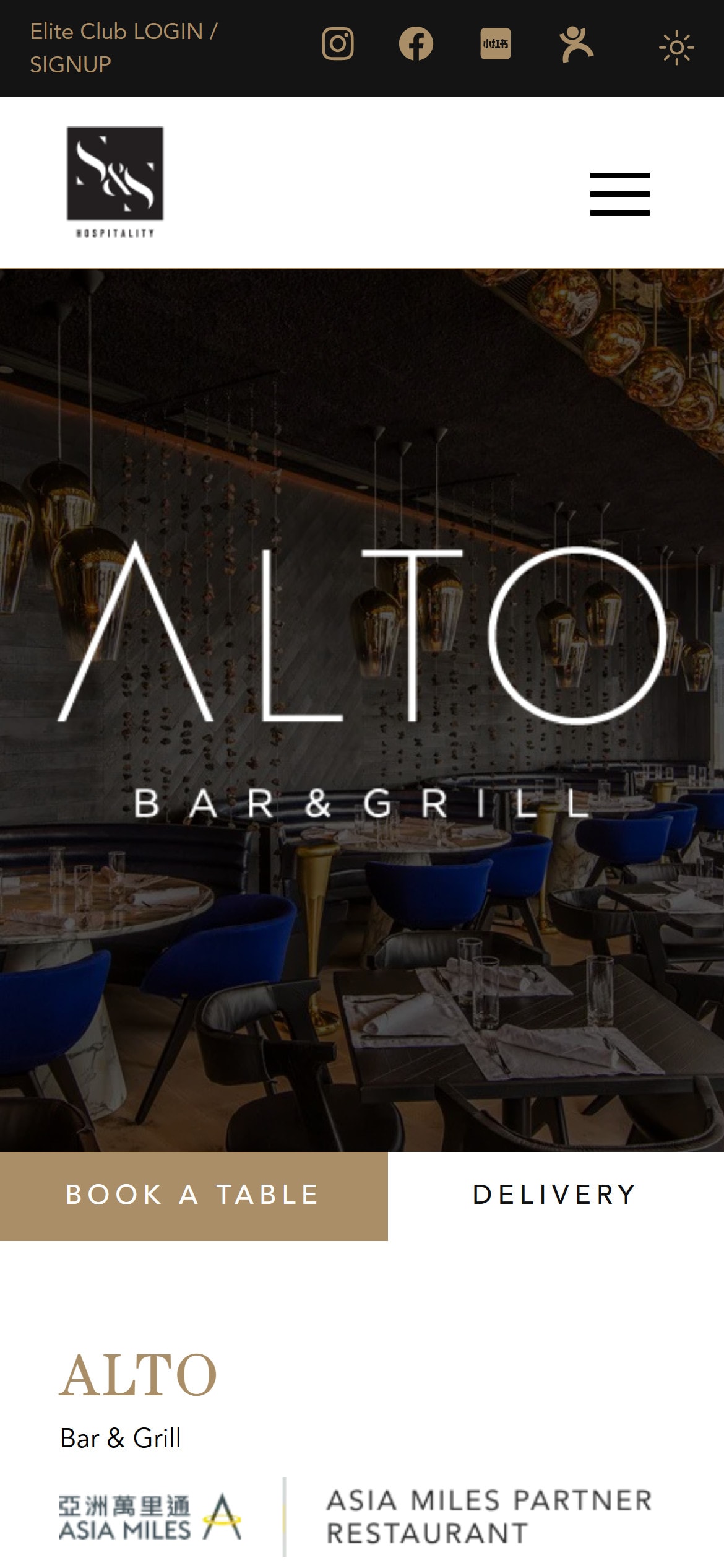
Anatomy of a restaurant page
Same bones. Different soul.
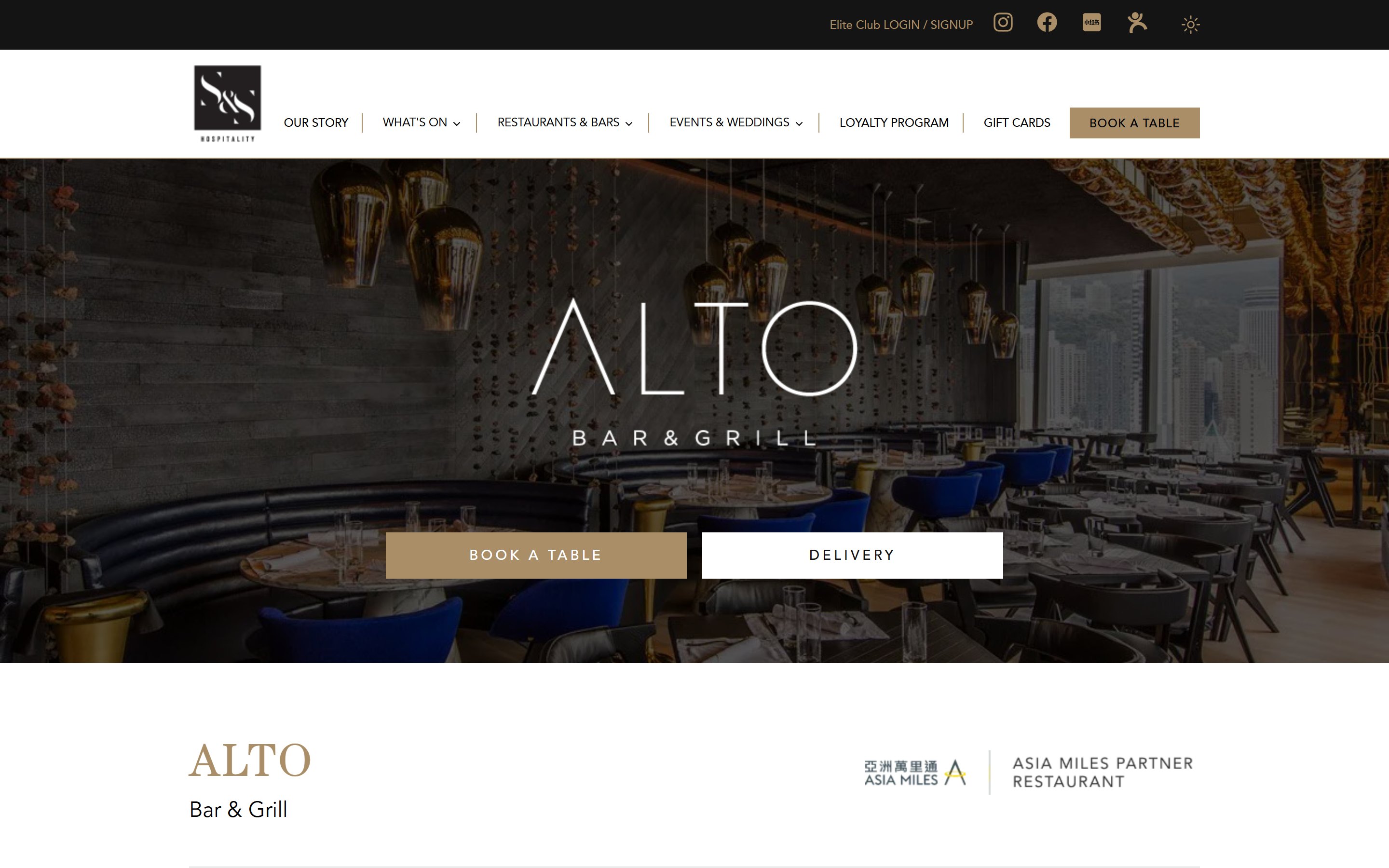
- 1
Brand first
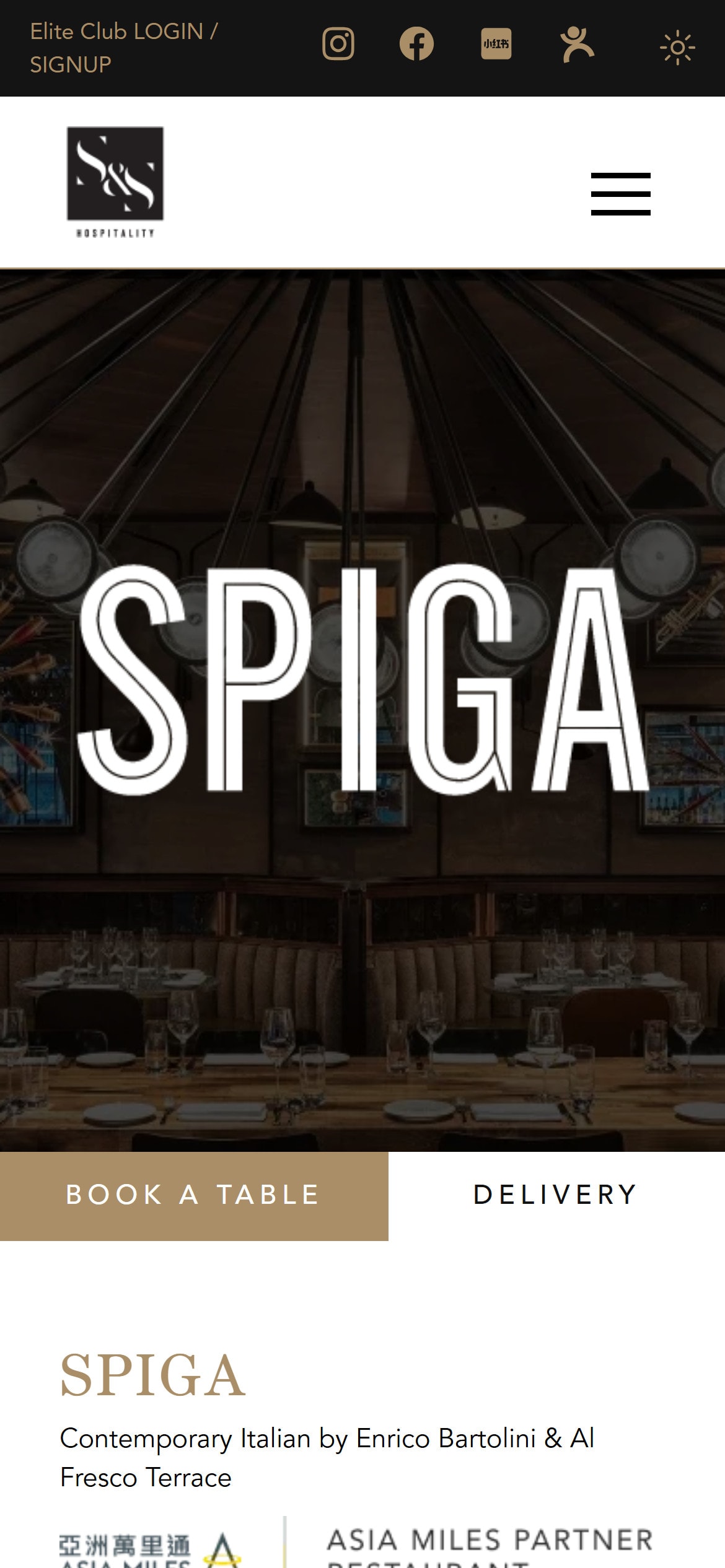
A full-width hero with the restaurant's own logo, never the group's.
- 2
Two actions
Book a table in gold, delivery in white. The same place on every restaurant.
- 3
Name in Century
The gold serif title and a one-line promise, set the same way for all eight.
- 4
Proof
Michelin Bib Gourmand and Asia Miles partner badges, right under the name.
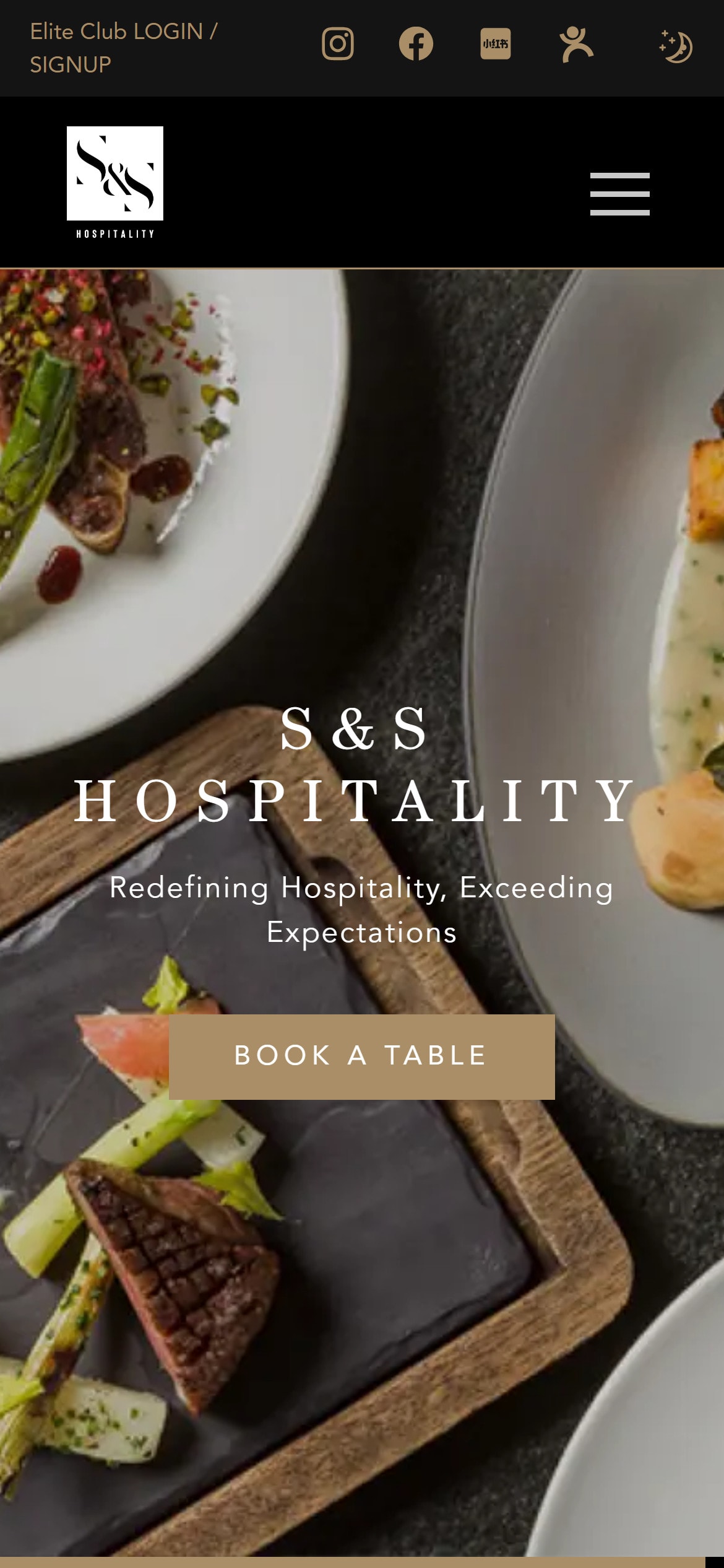
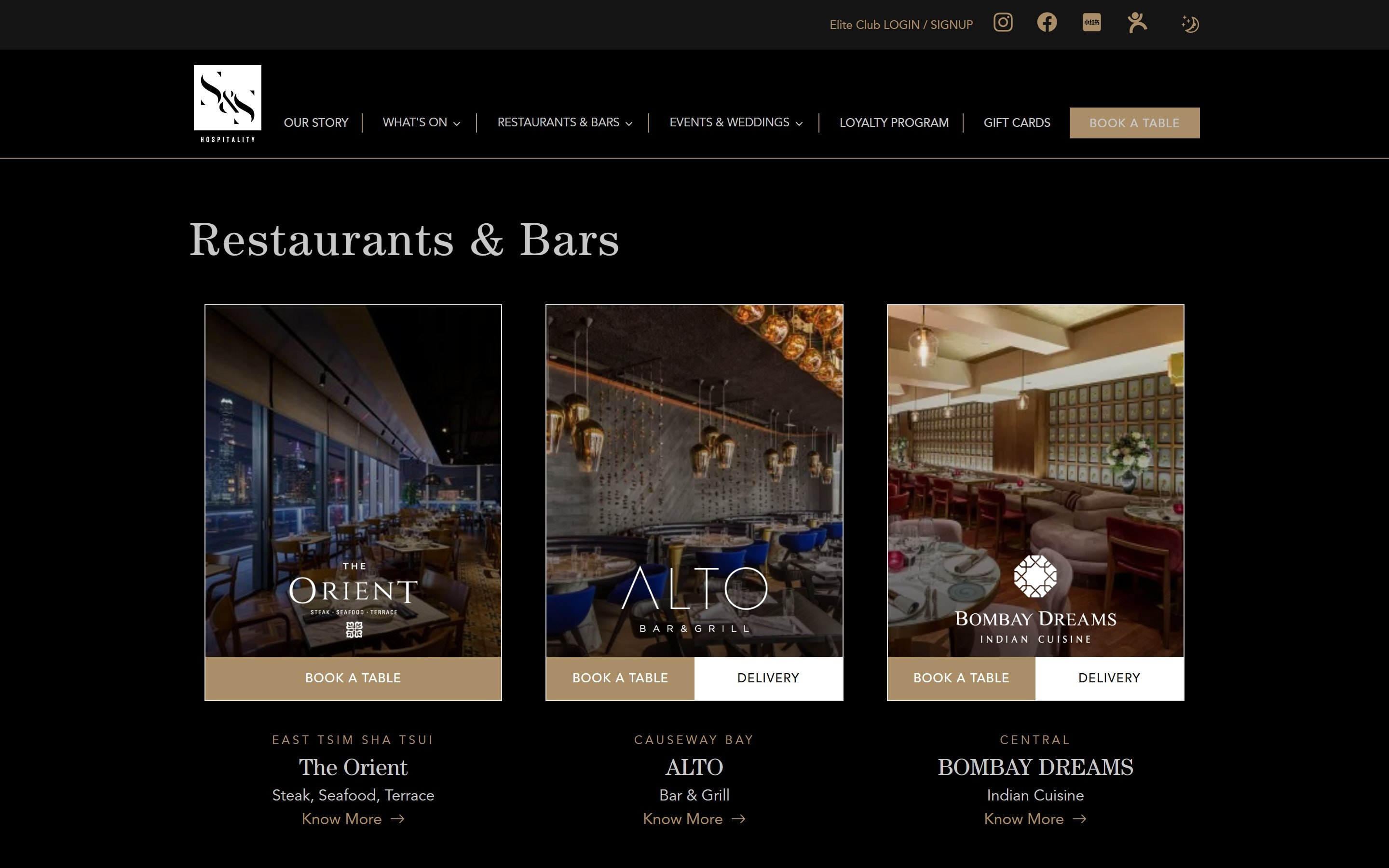
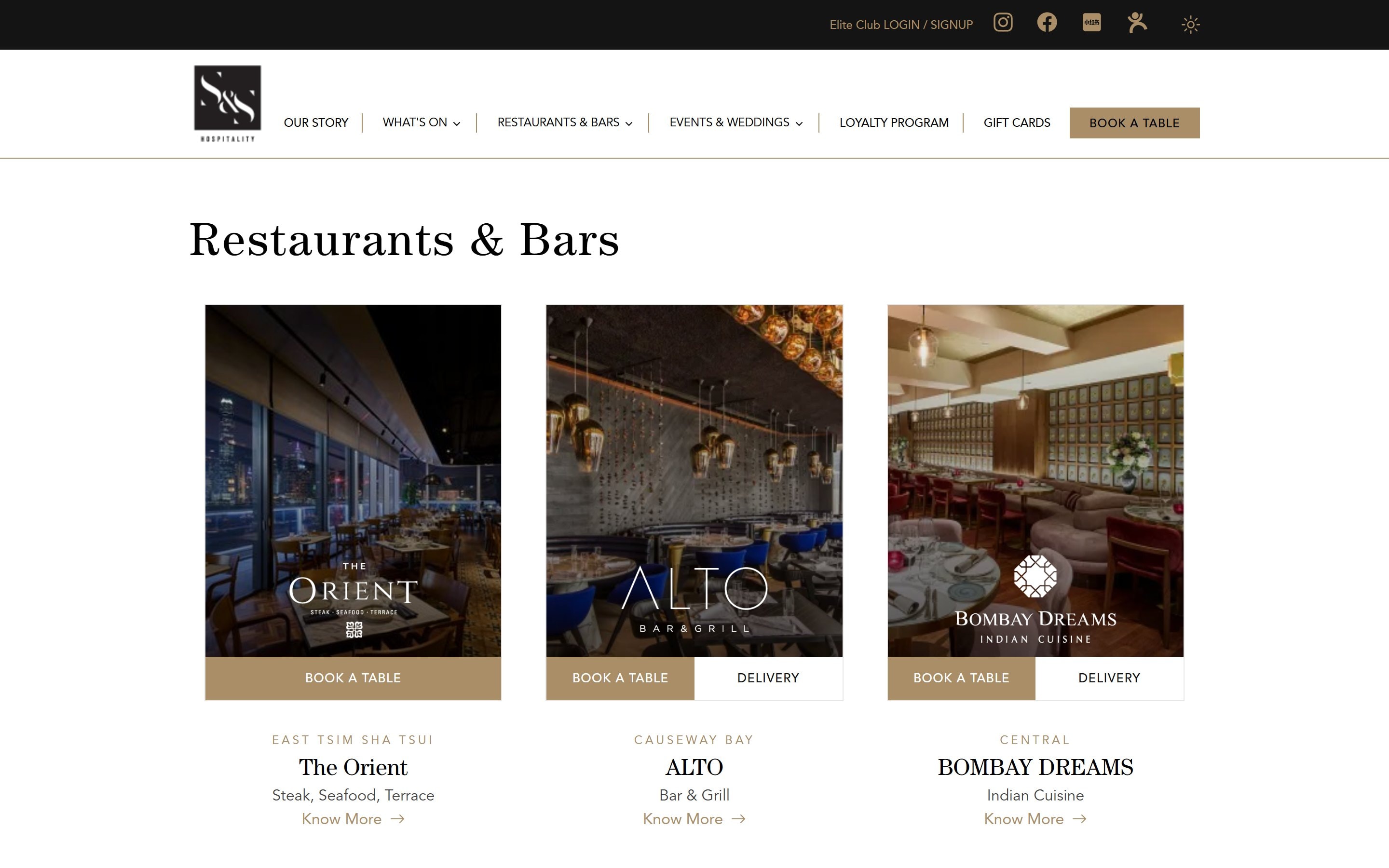
Light & dark
Lunch in the light. Dinner after dark.
The whole site follows the visitor's device setting, or a toggle in the header. Same components, same gold, two moods. Drag to compare.
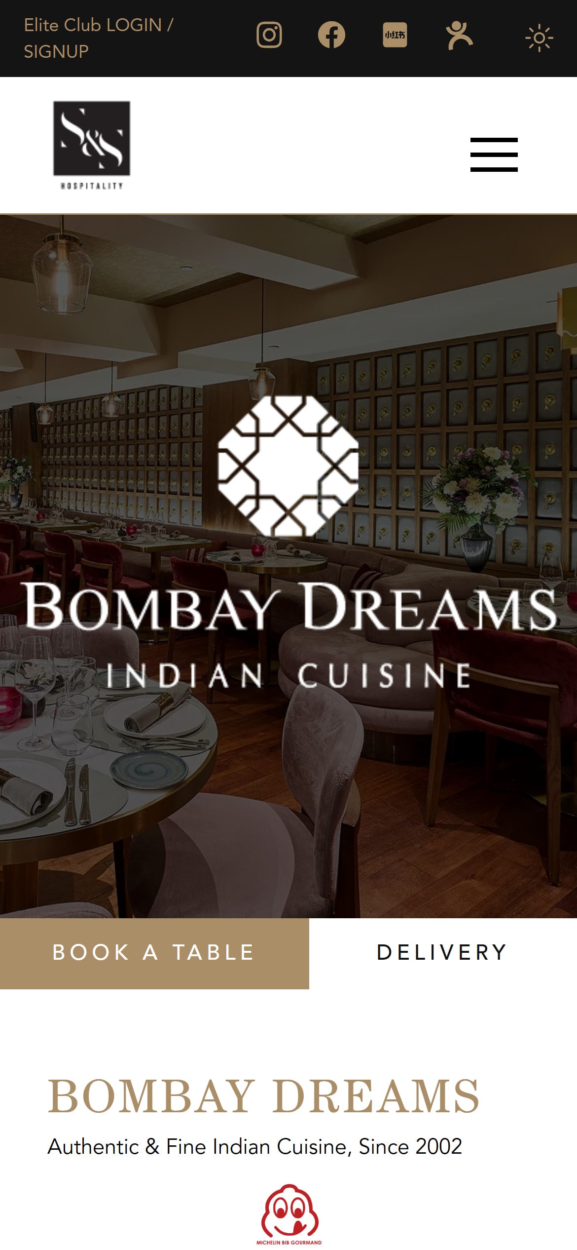
Made for the phone
Most guests book from their pocket.
Every restaurant page puts the logo, the room and the “Book a table” button in the first screen. A floating booking button follows you down the page.
Beyond the restaurants
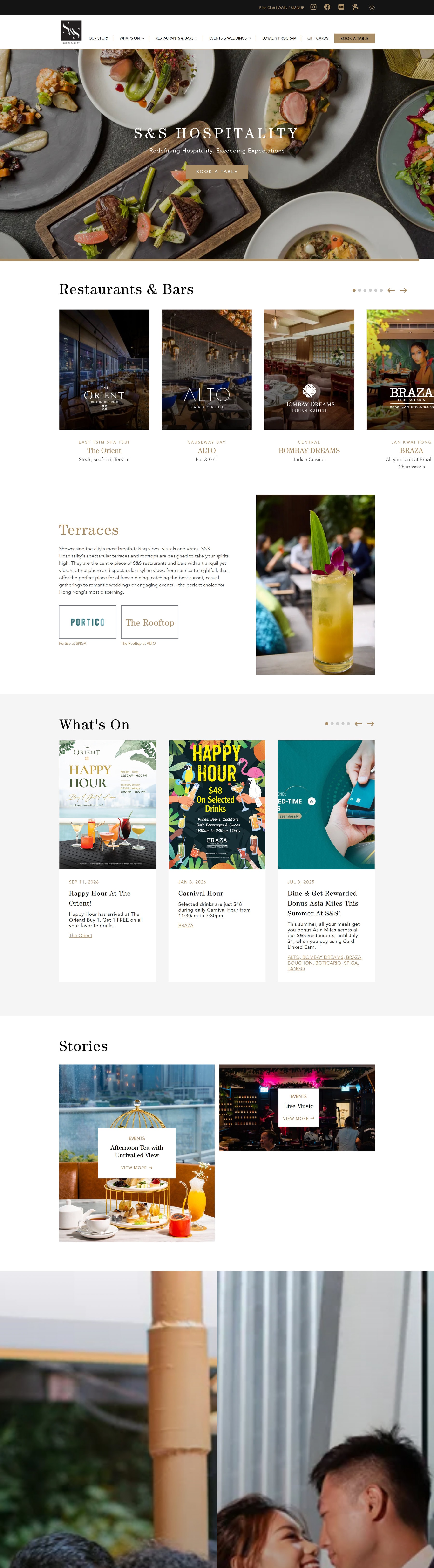
The group, in the same voice.
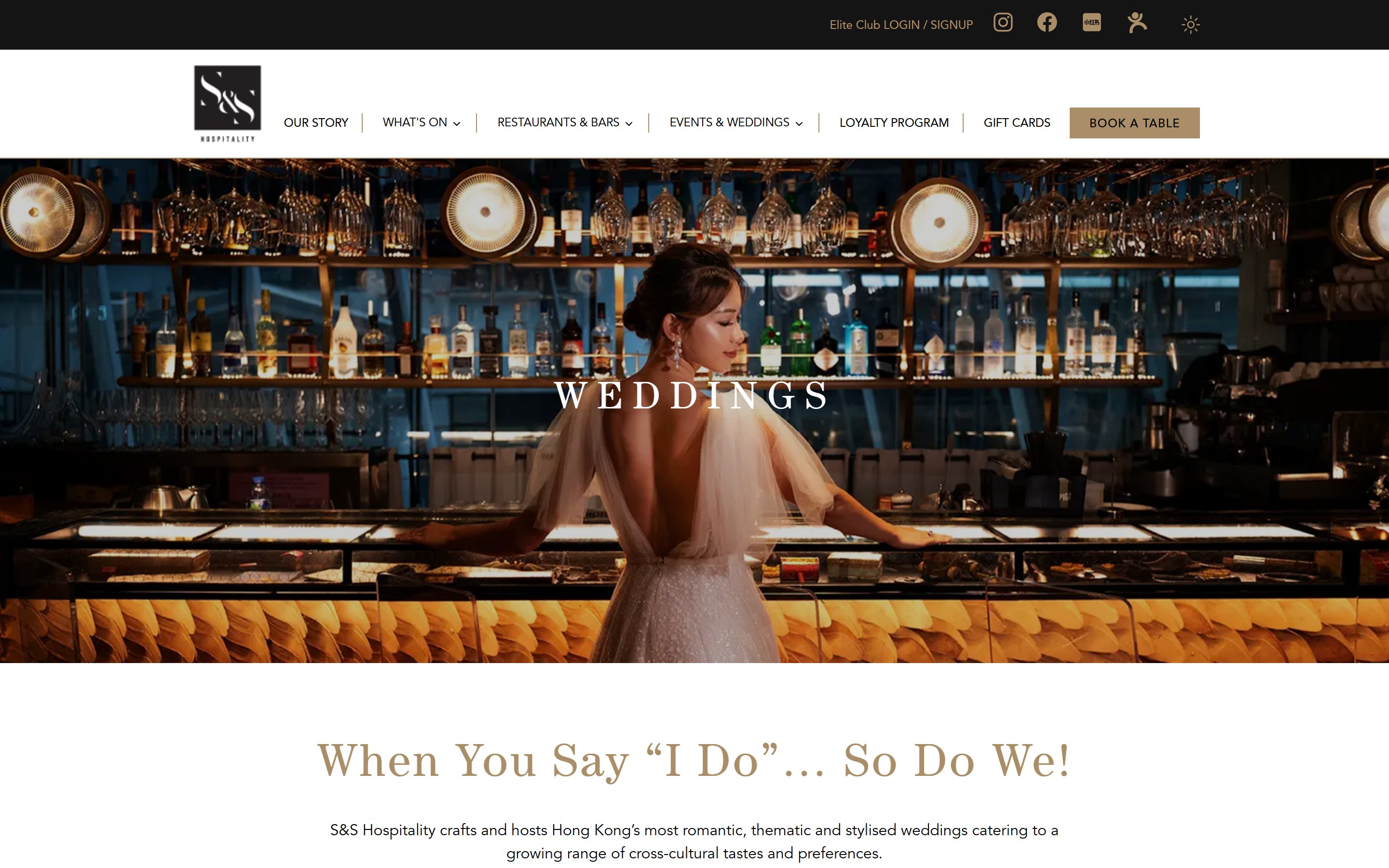
Weddings & events
Romantic, editorial pages for weddings, corporate and private events, with enquiry forms.
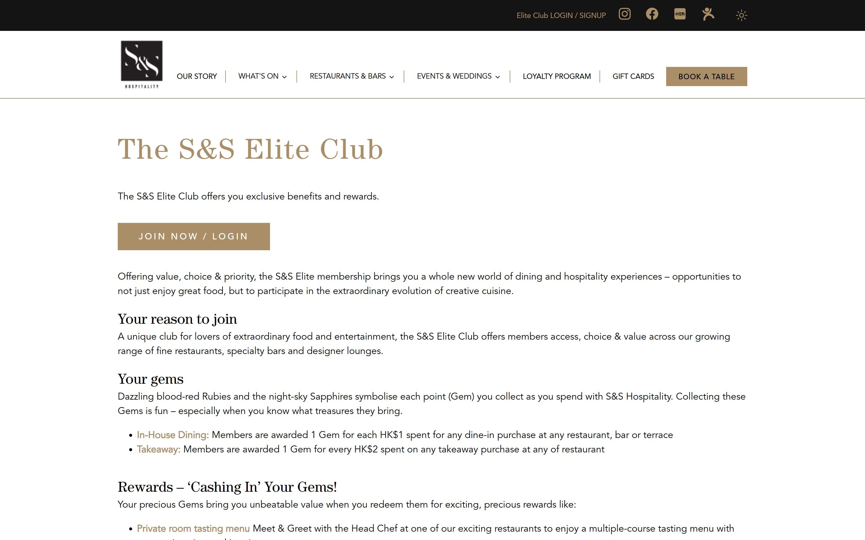
Elite Club
The loyalty programme: gems, rewards and member sign-up, styled like the rest of the house.
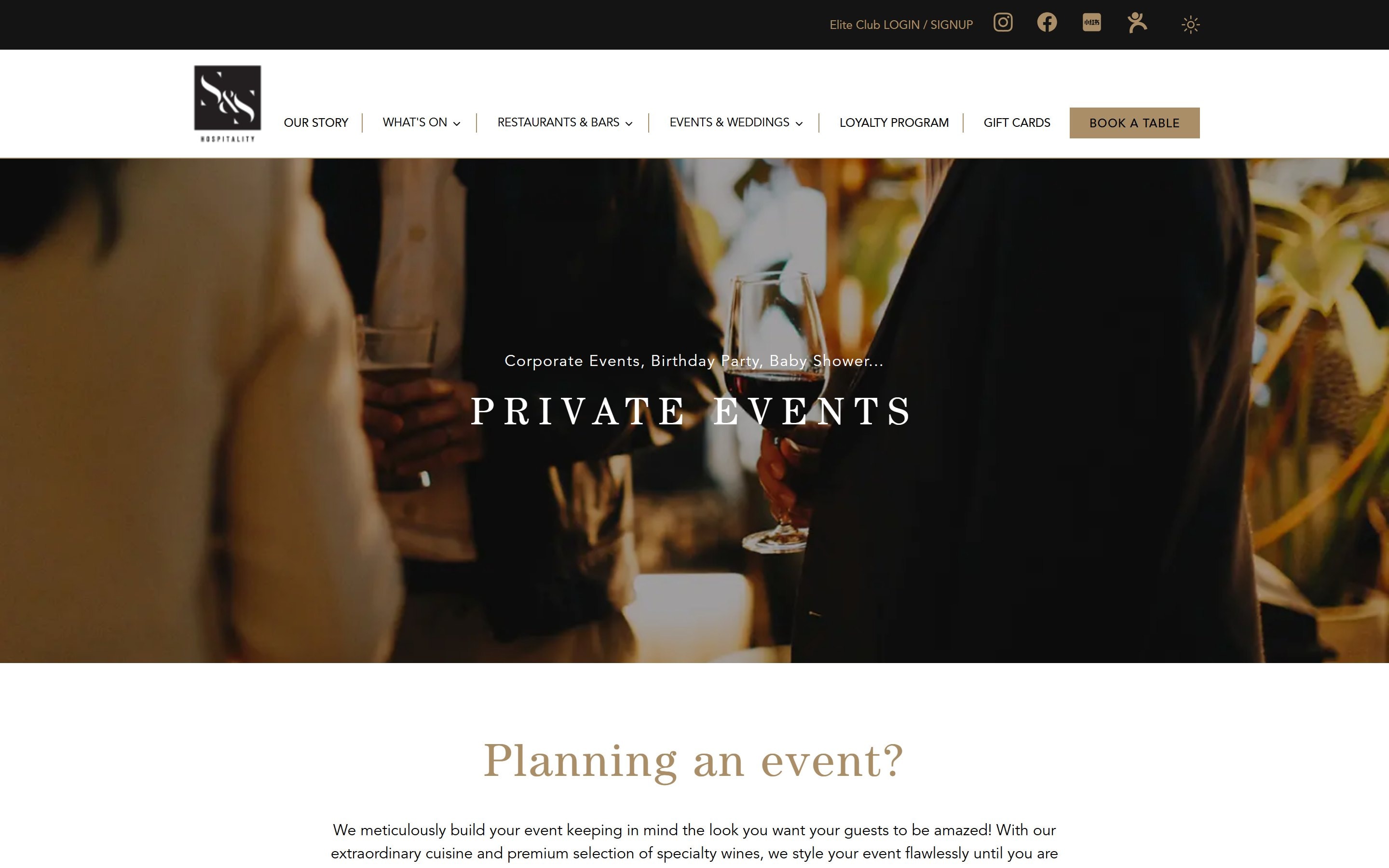
Private events
Venue and catering pages that sell the group's terraces and rooftops.
Behind it all: a Strapi CMS where the team updates menus, offers and stories without us, gift cards, booking links for every venue, contact and careers forms, and a private training area for staff.
What we did
- Web design
- Design system
- Light & dark themes
- Mobile design
- Web development
- CMS & ongoing care
Built with
- Next.js
- React
- Strapi CMS
- Tailwind CSS
- Resend
- Vercel
Running more than one brand?
We design systems that let every brand be itself, and still look like one family. Tell us about yours.